 |
| 8 "Pale Vines" 12x12 oil on board, ©Laura Gable |

Thursday, August 9, 2012
8 "Pale Vines"


Wednesday, August 8, 2012
7 "Within the Summer Heat"
 |
| 7 "Within the Summer Heat" 12x12 oil on board, ©Laura Gable |
So using a slightly dulled yellow (naples) and a brownish red (transparent red oxide), along with a brighter blue (thalo), these vineyard views showcase some interesting muted color and tones. I'm enjoying the slightly greyed greens and blues. A few other colors were allowed in, but the palette was pretty limited. Sometimes the extreme summer heat and overcast skies from our smoky air mute the colors this way. Have you observed this? Enjoy.
Tuesday, August 7, 2012
6 "Pinky Drinky"
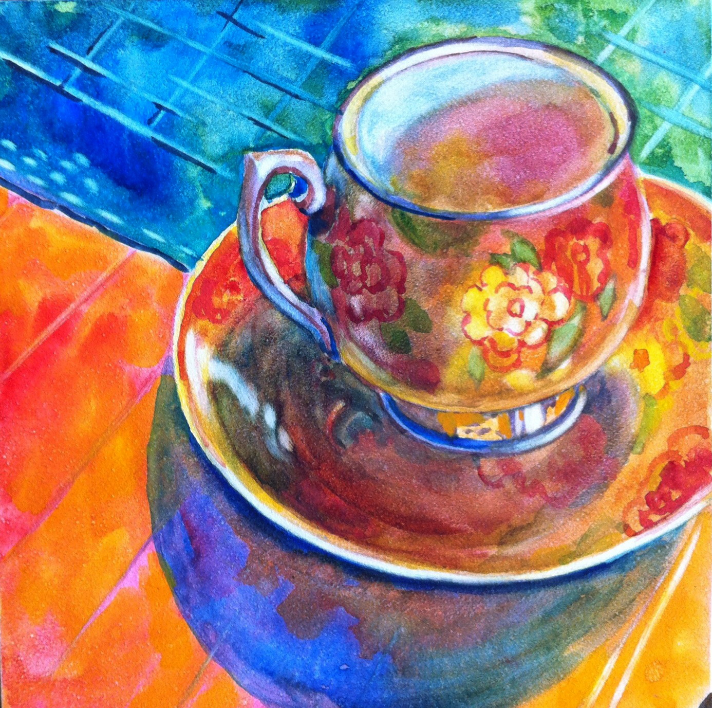 |
| 6 "Pinky Drinky" watercolor on Aquabord, ©Laura Gable |
Monday, August 6, 2012
5 "Demitasse Tea Cup"
 |
| 5 "Demitasse Tea Cup" watercolor on aquaboard, ©Laura Gable |
Hope you have a little spot of tea and think of me, today. My exciting daily self imposed challenge continues. It's an effort to create a piece of art daily until my studio open house in November. Look for even more details to come.
Sunday, August 5, 2012
4 On a Blue Day
 |
| 4 "On a Blue Day" 8x8 oil on board, ©Laura Gable |
Saturday, August 4, 2012
3 Somber Figurine
 |
| 3 "Somber Figurine" 3x6 oil on board, ©Laura Gable |
Friday, August 3, 2012
2 After Picasso
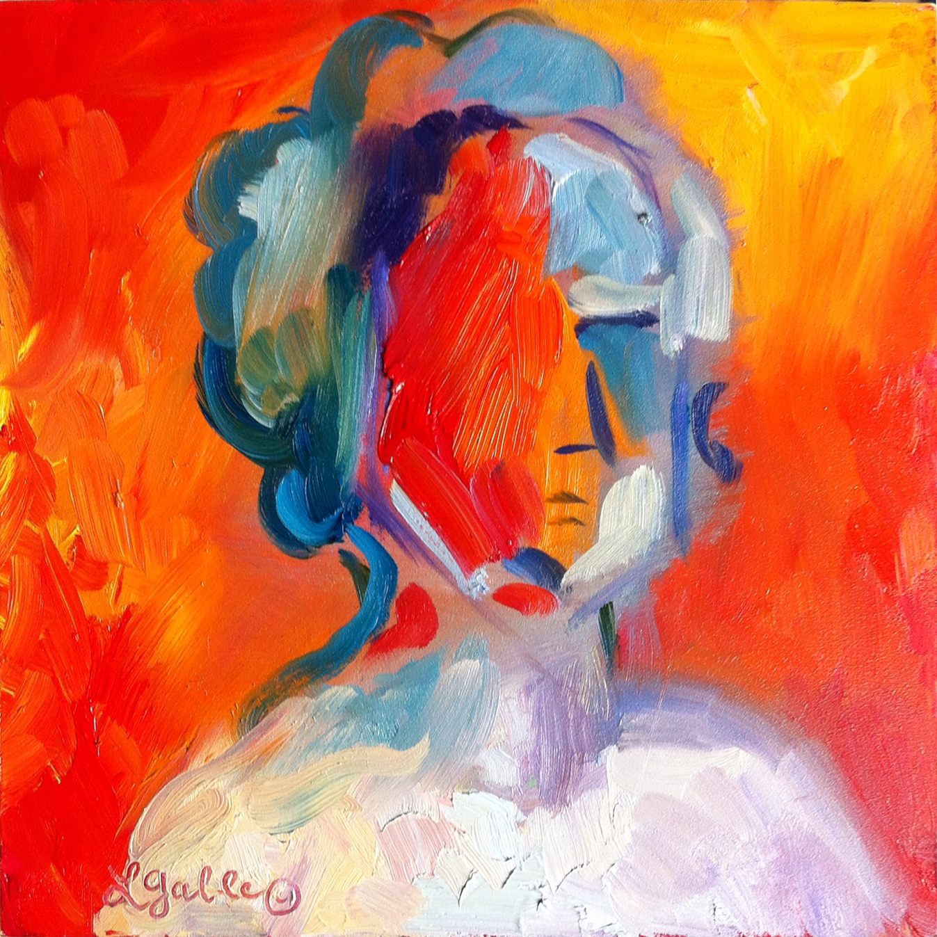 |
| 2 "After Picasso" 8x8 oil on board, © Laura Gable |
I've titled it, After Picasso ... as I am assuming this is how his portrait series' of misplaced facial features came about. But then again, he was just genius so does one ever really know where the idea came from?
My personal challenge to create 100 paintings in 100 days continues. More on this later (tease tease). Comments are welcomed here, as are more followers.
Thursday, August 2, 2012
1/100 and a "Sonnet for the Red Onion"
 |
| 1 "Sonnet for the Red Onion", 8x8 oil painting on board, ©Laura Gable |
And more about the 100 piece personal challenge in a few posts to come.
100 in 100 explained
What is the 100 in 100 Challenge?
A self-challenge I adopted on August 2nd to create 100 paintings in 100 days. Ideally that would mean doing a painting a day, though I do allow myself a few exceptions. Most of the painting is done on 8x8 or 12x12 Ampersand gessoboards. The purpose of this challenge is to create a more definite habit of creating art. The end of the challenge coincides with my annual Open Studio on November 10th and 11th. These paintings will be displayed together then and will be for sale in my studio. So please won't you make it a point to come by and visit to see these little gems up close and personal. I would love to show you around.
Comments are welcomed here on this blog!
The Tri City Artists Open Studio Tour, in it's 9th year, is featuring 16 artists in 15 studios. A driving tour about the greater Tri-Cities region with an opportunity to peek into the artist's secret lair, living room, or studio. Some artists rent studio space but most of the studios are home studios, making this a once a year opportunity to visit some of them. Admission is free. See you soon.
A self-challenge I adopted on August 2nd to create 100 paintings in 100 days. Ideally that would mean doing a painting a day, though I do allow myself a few exceptions. Most of the painting is done on 8x8 or 12x12 Ampersand gessoboards. The purpose of this challenge is to create a more definite habit of creating art. The end of the challenge coincides with my annual Open Studio on November 10th and 11th. These paintings will be displayed together then and will be for sale in my studio. So please won't you make it a point to come by and visit to see these little gems up close and personal. I would love to show you around.
Comments are welcomed here on this blog!
The Tri City Artists Open Studio Tour, in it's 9th year, is featuring 16 artists in 15 studios. A driving tour about the greater Tri-Cities region with an opportunity to peek into the artist's secret lair, living room, or studio. Some artists rent studio space but most of the studios are home studios, making this a once a year opportunity to visit some of them. Admission is free. See you soon.
Friday, July 27, 2012
Sketch for "Well Worn"
 |
| Sketch for "Well Worn" ©Laura Gable |
Thursday, July 26, 2012
Randomosity
 |
| "Randomosity" acrylic inks on 6x6 clayboard, © Laura Gable, SOLD |
Color was important after I'd been working a while with the black inked scratchboards. So tinting the clayboard seemed just the ticket. The FW acrylic inks were the perfect surface treatment. Once dried, the inked surface was scratched a bit. Acrylic ink was added more opaquely in the top layers, then lifted in places as they started to dry. I was happy with the color results. The blues have such a comforting sky-like color. Often when I add blue to a painting, it's like breath has been added to the piece. The painting somehow can breath. In plein air painting, we say that it has an airy quality.
I enjoyed the movement and flow of this piece. In the midst of all the movement there's the underlying framework which adds balance. Like our overcommitted lives, perhaps? Eat healthy and take care of yourself in order to take on the day and all the firehose of information that comes into our lives.
Enjoy!
Sunday, July 22, 2012
"Well Worn"
 |
| "Well Worn" 6x6" oil painting on board, ©Laura Gable |
I recall my Grandpa wore similar boots back in the 60's. I'm sure he tucked them away in the same manner as my Dad does. In almost every memory of him, he was wearing these big boots. He shuffled when he walked, and had a heavy step. You could always hear him coming and with a booming voice as he entered the room.
So for today, a melancholy small painting to share, and a sweet reminiscence of these two great men.
Tuesday, July 10, 2012
Scratch Board Art
 |
5x7" Scratch board Art: "Stately" with acrylic ink (SOLD); "Visionary";
"Rooted in Possibility" with acrylic ink (SOLD); "Breaking Open"
|
Scratch board is an amazing product from Ampersand, available at many art supplies stores. I get mine locally at Hobby Lobby when they are in stock, or order them online at Dick Blick or Daniel Smith. Ampersand also has a nice website, detailing some of their paintable surface products. http://www.ampersand.com
It is a clay coated Masonite board covered with a thin layer of black India ink. The white clay is revealed with even the slightest scratching on the surface. Kits with a variety of tools and inks are also available, but my tool of choice is a carpenter's awl shaped like a pencil. (Which surprisingly and accidentally made it through airport security in my purse one time). It has a nice weight and fits into my hand well. I found it at the hardware store. The ones with the fat bulb like tops are difficult for me to hold, as they are unevenly weighted.
Once you decide on a design, it is drawn onto the board with white colored pencil or regular pencil, or if feeling adventurous -- just start scratching without a guide. Graphite paper can also be used to transfer the image. It is very forgiving, especially if you use a light touch and don't dig too far down into the clay material.
For the coloring, I purchased the FW Acrylic Inks at Daniel Smith. He sells sets with various colors. The iridescent colors are very nice and add that glittery touch without being too overbearing and shiny. Just a light coating is perfect, and most of the color goes where the black has been scratched away. Sometimes many layers of scratch followed by ink are necessary to achieve the look. Final coating is with an acrylic varnish. I like to mix the gloss and matte together to create a satin like shine.
Hope you enjoy these fun little images. Photographing them can be challenging, but I will post a few more that I did using watercolor and gouache.
Monday, July 2, 2012
Nested Home
 |
| "Nested Home" oil painting on 6x6 canvas. SOLD |
This little painting was done on a black gessoed canvas. The "bice" blue was added for the background. It's a slightly greyed blue that denotes our lovely magnificent skies. Sometimes depending on the overcast quality of the sky, it can be greyed even more using a smattering of cadmium orange. Quite versatile, it can also be lightened with white or brightened with other blues for sunnier days.
The little egg rests alone in this colorful nest, and so the question arises as to where the other eggs might be. Rare it is for a bird to lay only one egg. We currently have a robin's nest on our back pergola--full of 4 active and healthy hatchlings. Their little heads now poke up beyond the perimeter and their necks seem made of elastic when the parents arrive with meals of wiggly worms. Every 10 minutes or so they feed, and continue through most of the day. Seeing how much they consume, it's no wonder they grow so quickly. It's usually only 2 weeks once born that they depart the nest.
Subscribe to:
Posts (Atom)